Heat Map Interpretation: Best Practices for Analysing Patterns
Updated On: October 26, 2025 by  Aaron Connolly
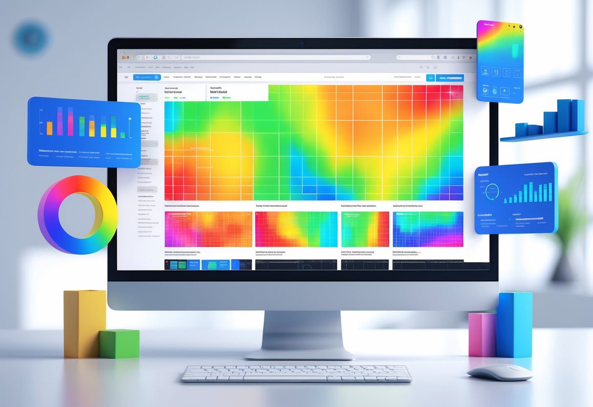
Core Principles of Heat Map Interpretation
If you want to read heat maps well, you need to get comfortable with colour scales, spot useful patterns, and know where these visualisations might trip you up. These three things really shape whether your analysis gives you anything useful.
Understanding Colour Scales and Legends
The colour scale is basically your guide—it tells you what the heat map is actually saying. Usually, “hot” colours like red mean high values, and “cool” ones like blue or green mean low values.
Key elements to check first:
- Scale range: What are the lowest and highest numbers?
- Colour intervals: Are the steps between colours even?
- Data type: Are you looking at raw numbers, percentages, or rankings?
You’ll notice that different heat maps use different scales. For example, a correlation heat map might go from -1 to +1, while a website heat map could show clicks ranging from 0 to 500.
Always glance at the legend before you start making guesses.
Some heat maps use logarithmic scales. That means each colour step jumps by a lot more than it looks. If you miss that, your interpretation could be way off.
Heads up: Don’t compare heat maps with different scales. A “red hot” spot on one map might actually be less intense than a “blue” spot on another if the scales don’t match.
Identifying Patterns and Hotspots
If you want to get better at pattern recognition, you have to look past just the brightest spots. Hunt for clusters, gradients, or even weird gaps in the data.
Primary patterns to look for:
| Pattern Type | What It Shows | Common Examples |
|---|---|---|
| Clusters | Related data points grouped together | User clicks on similar page elements |
| Gradients | Gradual changes across areas | Temperature variations across regions |
| Outliers | Isolated high or low values | Unusual spikes in data |
| Gaps | Areas with no activity | Ignored website sections |
Start with the most intense areas, but don’t ignore those medium zones. Sometimes those spots tell you more than the obvious peaks.
Check for symmetry or asymmetry in the patterns. Symmetry might hint at natural behaviour, while asymmetry could mean something’s broken or there’s an unexpected opportunity.
Quick tip: Try covering up the brightest areas with your hand. What jumps out in the rest of the data?
Recognising Limitations and Potential Bias
Heat maps can easily fool us. The biggest mistake? Thinking correlation means causation just because a pattern pops up.
Sample size is huge. If you only have 10 data points, your heat map will look totally different than if you had 10,000. Always check how much data backs up what you’re seeing.
Temporal bias creeps in all the time. If you collect data on a weekend, it might not match normal usage. For example, website traffic on a Saturday doesn’t look like a Monday.
Geographic or demographic bias can sneak in too. If your data mostly comes from one region or group, your patterns might not work elsewhere.
Technical limits can hide important stuff. Eye-tracking heat maps only show where people looked, not what they understood. Website heat maps might skip mobile users if you don’t set them up right.
The way you filter or process data before making a heat map really changes what you see. Different algorithms can give you totally different patterns, even from the same raw data.
Types of Heat Maps and Their Applications
Heat maps generally fall into two types, and each serves a different purpose. Grid-based heat maps use rows and columns with colour intensity, while spatial heat maps show data laid out over physical spaces or maps.
Grid-Based Heat Maps
Grid-based heat maps lay out data in a matrix, with each cell showing a specific value. The colours tell you how high or low each value is.
Correlation matrices are everywhere. They show how different variables relate, from -1 to +1. Usually, darker shades mean strong relationships, and lighter ones mean weak or no connection.
Confusion matrices help you see how well a machine learning model predicts. The diagonal shows correct answers, and the other cells show mistakes.
Website heatmaps track where users click, scroll, or hang out. Marketers use these to tweak page layouts and improve conversions.
Analysts often cluster these heat maps to group similar variables. That’s how you spot hidden patterns that don’t show up when things are just listed alphabetically.
Spatial Heat Maps
Spatial heat maps show data across actual locations or two-dimensional spaces. They use colour gradients to show how intense or frequent something is in different spots.
Geographic heat maps display things like population, sales, or weather across regions. Emergency services use these to spot high-crime or accident areas.
Website heatmaps can fit here too, especially when they show where users interact with specific parts of a page. Click maps highlight popular buttons or links, while scroll maps show how far people go.
Gaming companies love spatial heat maps for tracking player movement in virtual worlds. They figure out which areas are popular and adjust gameplay.
Eye-tracking studies also use spatial heat maps to show where people look on screens or ads. Designers use this info to make layouts more user-friendly.
Analysing Correlation Heat Maps
Correlation heat maps highlight how strongly different variables relate and in which direction. The colour patterns make it easy to see which variables move together and which ones move apart.
Reading Correlation Matrices
A correlation matrix lays out numbers between -1 and 1 for every pair of variables. These numbers show exactly how two things relate.
You’ll always see a diagonal from top-left to bottom-right showing perfect correlation (1.0). That’s just because each variable lines up with itself.
Key correlation strength ranges:
- 0.7 to 1.0: Strong positive relationship
- 0.3 to 0.7: Moderate positive relationship
- -0.3 to 0.3: Weak or no relationship
- -0.7 to -0.3: Moderate negative relationship
- -1.0 to -0.7: Strong negative relationship
The matrix is symmetrical. The correlation between A and B is the same as B and A.
Identifying Positive and Negative Relationships
Colours in correlation heat maps make spotting patterns a lot easier. Most use red shades for positive correlations and blue for negative ones.
Positive correlations mean both variables rise together. Warm colours like red or orange usually mark these.
Negative correlations mean when one goes up, the other drops. Cool colours like blue or purple highlight these.
Darker colours mean a stronger connection. Lighter shades or white? That usually means the relationship is weak or maybe not useful.
Look for clusters of similar colours. That’s where you’ll find groups of related variables working together.
Clustered Heat Maps and Dendrograms
Clustered heat maps mix colour-coded data with hierarchical clustering to dig up hidden patterns in complex datasets. The dendrogram acts as a visual map, showing which samples or variables group together by similarity.
Interpreting Hierarchical Clustering
Hierarchical clustering builds a tree that lays out how data points relate. We read these by checking where the branches meet on the dendrogram.
Distance is key. Items that connect with short branches are very similar. Long branches mean there’s a bigger difference.
The height of each junction tells us how strong the cluster is. Low junctions mean strong similarity. High ones? Not so much.
| Junction Height | Similarity Level | What It Means |
|---|---|---|
| Low (bottom) | Very similar | Strong clustering |
| Medium | Moderately similar | Loose grouping |
| High (top) | Quite different | Weak connection |
We can slice the dendrogram at any height to make groups. Cutting lower gives you more clusters, while cutting higher means fewer, broader ones.
Using Dendrograms to Uncover Patterns
Dendrograms show patterns you’d never spot in a table of numbers. We look for groups that pop up across both rows and columns.
Sample clustering (columns) reveals which experiments act alike. This helps us spot biological replicates or treatment effects. Samples from the same group should stick together.
Gene clustering (rows) highlights genes that act in sync. Genes in the same cluster often do similar things.
Common patterns you might see:
- Tight clusters: Strong signals or technical repeats
- Outlier branches: Oddball samples or contamination
- Mixed clusters: Complicated responses
We use these groupings to check if our experiment design holds up. Clear separation between groups is good news. If the clusters are messy, something might be off.
The colour scale should back up what the dendrogram shows. If similar colours group together, that’s a good sign.
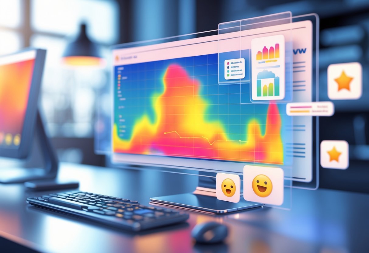
Website Heat Map Interpretation for User Behaviour
Website heatmaps let us see exactly where users click, how far they scroll, and where they move their mouse. Each type of data uncovers different user behaviour patterns, helping us figure out what’s working and what’s not.
Click Maps
Click maps show where users click on a page. The colours tell you what’s hot (red) and what’s not (blue).
What Click Maps Tell Us:
- Which buttons and links stand out
- Where users try to click, even if it’s not clickable
- Navigation elements that get used or ignored
You’ll often spot users clicking on images, text that looks like buttons, or underlined words. If lots of people click something that isn’t interactive, maybe it’s time to add a call-to-action or make it clickable.
Common Issues to Look For:
- Key buttons not getting any clicks
- Non-clickable stuff getting lots of clicks
- Navigation items getting skipped
Click maps also help us catch “rage clicks.” When users hammer the same spot, they’re probably frustrated.
Scroll Maps
Scroll maps show how far people actually go down a page. The top always glows red because everyone sees it, but the colours cool off as you move lower.
Key Insights from Scroll Maps:
- What percentage of users see your important content
- Where most people stop reading
- Sections that might be buried too deep
Usually, less than half of users scroll below the fold. That means your most important stuff should be near the top.
Optimising Based on Scroll Data:
- Move key elements higher
- Try rearranging sections
- Make sure critical info appears early
If people only click important buttons way down the page, try moving them up and see if things improve.
Movement Maps
Movement maps track mouse movement as users browse. This tells us what grabs their attention before they even click.
What Movement Patterns Reveal:
- Areas that pull in attention
- Content users focus on
- Spots that cause confusion or hesitation
Mouse movement often follows the eyes, so movement maps give us a peek at reading patterns. Most users scan in an “F” shape—across the top, down a bit, then across again.
Using Movement Data:
- Find content that really gets attention
- Spot where users pause or get stuck
- Pick out elements that distract from the main goal
Movement maps work best when you mix them with click and scroll data. Together, they give you the full picture of how people experience your site.
Enhancing Conversion Rate Optimisation (CRO) with Heat Maps

Heat maps show us exactly where users click, scroll, and bail on our websites. This gives us real, visual data to break down conversion barriers and make our call-to-actions work harder.
When we dig into these patterns, we can tweak specific parts of our site and see conversion rates jump.
Identifying Conversion Barriers
Heat maps point out where users get stuck or lost on a website. If we notice heavy activity but no conversions in certain spots, we’ve probably found a problem.
Common barriers heat maps reveal:
- Users start forms but leave them unfinished
- Pages where people keep scrolling up and down
- Lots of clicking on things that aren’t actually clickable
- Content that everyone just skips
We spot these issues by watching for odd patterns. If people keep clicking on plain text, they’re expecting a link. If scroll maps show everyone stopping at the same spot, something’s in their way.
Heat maps also flag mobile headaches. Sometimes users tap buttons that are too tiny or wrestle with menus that work fine on desktop.
Quick win: Tackle high-traffic, low-conversion pages first. Fixes here usually pay off the most.
Optimising Calls-to-Action
Heat maps make it obvious how people interact with our call-to-action buttons. We see which CTAs get clicks and which ones barely get a glance.
Heat map insights for CTA optimisation:
- Placement: Move buttons into hot zones where users already engage
- Size: Make CTAs bigger if people keep missing them
- Colour: Switch up colours if buttons blend in too much
- Copy: Try new text if click rates are sad
We sometimes find users clicking things we never expected. If they’re poking product images like they’re buttons, maybe it’s time to make those images clickable.
Heat maps also help us pick the best spots for extra CTAs. Sometimes, people scroll right past our main button but interact with stuff farther down.
Warning: Don’t just guess how CTAs perform. Heat maps often prove our “perfect” button spot isn’t actually working.
Integrating Heat Maps with Data Visualisation Strategies

Heat maps really shine when we pair them with other visualisation tools. They show patterns at a glance, but they need backup from other methods to tell the whole story.
Comparing Heat Maps to Other Visualisation Tools
Heat maps are awesome for revealing data density and patterns across two dimensions. Bar charts compare values, but heat maps instantly uncover relationships.
Line graphs track change over time. Heat maps let us see time plus another variable. A line graph might show monthly traffic, but a heat map can show traffic by hour and day at once.
Scatter plots do a good job showing how two variables relate. Heat maps go further, using colour to show the strength of that relationship. Both have their place.
Here’s a quick breakdown:
| Tool | Best For | Heat Map Advantage |
|---|---|---|
| Bar charts | Comparing categories | Shows relationships between categories |
| Line graphs | Trends over time | Adds second dimension to temporal data |
| Pie charts | Parts of a whole | Reveals patterns within segments |
Dashboards get a boost from heat maps. People can scan them quickly, then dive into detailed charts as needed. This helps create a smooth analysis workflow.
Combining Quantitative and Qualitative Insights
Heat maps show us the numbers using colours. When we add context, they become even more valuable for decisions.
User feedback takes website heat maps up a notch. Click data shows us where users interact, but survey answers tell us why. Together, we get both the “what” and the “why.”
Contextual annotations turn basic heat maps into strategy tools. Sales heat maps might show regional wins, but market research tells us why some places outperform others.
We can layer data like this:
- Primary data: Main metric, shown by colour
- Secondary data: Use size or shape for extra info
- Qualitative labels: Add text to explain odd patterns
Interview insights sometimes clear up heat map mysteries. A customer service heat map might show weird peak hours, but staff interviews reveal what’s really happening.
Mixing these data types helps us move from “what happened” to “why did it happen?” Numbers mean more when we add real-world context.
Combining Heat Maps with Other User Feedback Methods
Heat maps work best when we use them alongside surveys and session recordings. This approach lets us see not just what users do, but also why.
Heat Map Analysis and Surveys
Website heat maps show us where users click and scroll. Surveys fill in the “why” behind those actions.
This combo brings out real insights. If heat maps show people clicking on non-clickable stuff, surveys can tell us what they expected. If users bail out of a form, survey answers might reveal which questions tripped them up.
Survey timing matters. We can trigger surveys based on heat map patterns. For example:
- Show exit surveys to users who barely spend time on key sections
- Pop up surveys after users click repeatedly in one spot
- Send follow-ups to users who finish important actions
Writing good survey questions starts with looking at heat map data. If users hover over an image but never click, ask them, “Did you want to click this image?” Targeted questions get better answers than generic ones.
We get the best results when we segment survey responses by the behaviour patterns we see in heat maps.
Session Replay Integration
Session recordings let us watch the full user journey that heat maps sum up. Together, they show us both the big patterns and the individual stories.
Heat maps point out trouble spots. Session replays show exactly what happened to specific users. This helps us decide what to fix first, based on how often and how badly things go wrong.
User experience gets better when we combine both tools. If heat maps show a call-to-action button isn’t getting clicks, session replays reveal if users:
- Never scrolled far enough to see it
- Saw it but ignored it
- Tried to click but hit a bug
Best practice: Filter session recordings using heat map insights. Instead of watching random sessions, we focus on the ones with worrying patterns. This saves time and gets us to the real issues faster.
Session replays also help us confirm what the heat maps are telling us.
Best Practices for Effective Heat Map Analysis

To get the most out of heat maps, we’ve got to avoid common mistakes and always double-check our findings by comparing different heat maps.
Avoiding Common Pitfalls
Jumping to conclusions without checking the colour scale is the biggest mistake we make. So many teams blow it because they misread the legend or just assume darker colours mean “more important.”
Always check the scale. A heat map showing temperatures from 20-22°C might look intense, but the differences are tiny. Also, see if the data’s been normalised—sometimes small changes look huge.
Heads up: Rainbow colour schemes can trip us up. Stick to simple gradients like blue-to-red or light-to-dark.
We sometimes forget about how rows and columns are ordered. If someone sorts or clusters the data, patterns can look totally different. A correlation matrix sorted alphabetically won’t show the same things as one sorted by similarity.
Quick win: Before digging into user behaviour, check if time periods or segments got rearranged to highlight certain trends.
Missing context ruins good analysis. If heat maps don’t have clear axis labels or data sources, we’re just guessing and wasting time.
Validating Insights Across Multiple Heat Maps
One heat map rarely tells the full story. We get stronger insights by comparing heat maps from different times, user groups, or data sources.
Make comparison sets to spot real patterns. If we see the same hotspots for three months straight, we know those insights are solid.
Split big datasets into smaller groups before making heat maps. Website traffic might look totally different on mobile versus desktop, and we miss that if we lump it all together.
Test your findings with other visualisation tools. If a heat map hints at a strong correlation, back it up with a scatter plot or a quick stats check. Skipping this step means missing out on important details.
Try different colour scales on the same data to spot bias. Switching from sequential to diverging colours sometimes reveals new patterns.
Write down what each heat map shows—and what it doesn’t. This keeps us from reading too much into the results or making claims the data just can’t support.
Real-World Examples of Heat Map Interpretation

Companies in all sorts of industries use heat maps to make smarter choices about their digital products. Here are some real examples of how businesses solve problems using heat map analysis.
Website Optimisation Case Studies
E-commerce product pages get a major boost from click heat maps. We often notice users clicking product images, hoping they’ll enlarge, but some sites never make that clear.
A clothing retailer found through click mapping that customers kept clicking on size charts that weren’t clickable. After making those charts interactive, returns dropped by 15%.
Scroll maps uncover hidden content issues on landing pages. A software company realised 80% of visitors never reached their testimonials at the bottom. They moved the social proof higher up and saw demo requests climb by 23%.
Movement heat maps highlight navigation problems. One news site saw mouse movements cluster around the search bar, hinting that readers couldn’t find articles through the main menu.
Product Development Applications
Mobile app developers use tap heat maps to fix button placement and layout. Gaming companies often discover players have trouble with controls during gameplay.
One fitness app saw users tap empty space next to the “Start Workout” button. The team realised the button was too small for bigger phones and made the clickable area larger.
SaaS platforms use zone-based heat maps to improve onboarding. These tools blend click, scroll, and movement data to show which steps confuse new users.
A project management tool learned from heat maps that new users ignored help tooltips. Instead of clicking question mark icons, people just explored features on their own.
Heat map data also helps product teams decide which elements to A/B test first.
Advanced Techniques in Heat Map Interpretation
Modern heat map analysis isn’t just about reading colours. We can use advanced customisation and interactive features to dig out deeper insights and create more engaging data experiences.
Customisation of Colour Scales
The colour scale is the backbone of any heat map. We can tweak these scales to match our data and our audience.
Sequential colour scales work well for data that goes from low to high—think pale blue to dark blue for temperatures, or light to deep green for sales.
Diverging colour scales are perfect when data splits around a central point. Red-to-white-to-blue schemes make it easy to spot both positives and negatives.
Categorical colour scales are great for data with clear groups that don’t follow an order. Each group gets its own colour, so nothing gets mixed up.
It’s always smart to test colour choices with real people. What looks clear to us might confuse others, especially anyone with colour vision differences.
Quick tip: Use online colour palette generators to keep your heat map accessible to all users.
Dynamic and Interactive Heat Maps
Interactive heat maps turn static data into something you can really dig into. These features let people explore the information, not just look at it.
Hover functionality gives you exact values when you move your mouse over a cell. You don’t have to guess, and the visual stays clean.
Zoom capabilities let you zero in on specific parts of a big dataset. This is a lifesaver with geographic or time-based heat maps.
Filter controls put you in charge of what you see. You can flip between time periods, categories, or data ranges, depending on what you care about.
Tooltip integration pops up extra info that doesn’t fit in the main view. Sometimes that’s percentages, comparisons, or just a quick note to help you out.
These interactive bits work best when they feel obvious and easy. If you need instructions, something probably went wrong.
Frequently Asked Questions
To read heatmaps well, you need to get comfortable with colour intensity, legends, and how the data connects. People often ask about spotting patterns, what colours actually mean, gene analysis, business uses, and how to make heatmaps in the first place.
What can I look for to understand the patterns in a data visualisation heatmap?
Start by focusing on colour intensity. Darker shades usually mean higher values; lighter ones show lower values.
Find clusters of similar colours. These groups often point to trends or relationships you don’t want to miss.
Watch for smooth colour changes across the map. If you see a gradual shift, that’s probably a continuous pattern. Sharp colour jumps? Those mark clear boundaries.
Outliers stand out as single cells with a totally different colour. They might be errors or just weird data points, but they’re worth checking.
Look at row and column patterns. If a whole row or column shares a colour, that hints at consistent behaviour across those categories.
How can one decipher the meaning behind different colours in a correlation heatmap?
Always check the legend first. The colour scale usually runs from -1 to +1, mapping out negative to positive correlation.
Red or warm colours show positive correlation. If one variable goes up, so does the other.
Blue or cool colours mean negative correlation. One goes up, the other drops.
White or neutral shades signal little or no connection between variables.
Pay attention to how intense the colour is. Deep red means a strong positive link; pale red is pretty weak.
What insights can be gained from analysing gene expression through a heatmap?
You can spot which genes act alike in different conditions or samples. Genes that cluster together might share similar roles.
Look for genes that stay high or low across samples. These could be basic housekeeping genes or ones tied to specific cell types.
Sample clustering lets you group similar biological conditions. If samples have matching gene patterns, they probably share traits.
You might notice genes that react a lot to certain treatments. These show up as distinct colours in a column or group.
Contrasting colours between sample groups make differential expression obvious. That helps when you’re hunting for biomarkers or targets.
Could you give me some examples of heatmaps and explain what they represent?
Website click heatmaps show where people click most. Red spots mean lots of clicks; blue means not much action.
Weather temperature maps show how temperatures change across places. Warmer colours flag hotter spots.
Stock market correlation matrices reveal which stocks move together. Warm colours mean strong positive links; cool colours show negative ones.
Sports performance heatmaps track where players spend their time. You can see their movement and activity zones.
Customer behaviour heatmaps highlight shopping patterns across products. Busy areas show popular items or peak times.
In what ways do businesses use heatmaps to gain valuable insights?
Businesses use heatmaps for website optimisation all the time. We check user behaviour to tweak layouts and boost conversions.
Retailers map foot traffic to place products better. Hot zones get premium items; cold zones need some love.
Customer service teams look at call volume heatmaps by time and day. That helps with scheduling and planning.
Marketers use demographic heatmaps to target the right audience. These show which groups respond best to certain messages.
Sales teams track performance heatmaps across regions and products. This helps spot top areas and where things could improve.
What are the steps to creating a geographic heatmap in Excel?
First, organize your data. Put location coordinates or region names in their own columns. Drop your metric values in a column right next to them.
Now, highlight your data range. Click “Maps” from the Insert tab. Excel usually picks up on geographic data without much fuss.
Tweak the color scale using the Format Data Series options on the chart. You’ll want to set minimum and maximum values that make sense for your data.
Change up the legend and color scheme so it fits your style. Honestly, intuitive colors help—a dark shade for higher values just feels right.
If you need them, toss in some data labels. Adjust the chart size so everything’s readable. Don’t forget to try out a couple of color palettes; you want everyone, including color-blind folks, to actually see what’s going on.