Colourblind Mode Importance: Why Accessibility Matters Online
Updated On: November 12, 2025 by  Aaron Connolly
Understanding Colour Blindness
About 8% of men and 0.5% of women worldwide deal with colour blindness. It’s not about seeing everything in black and white—most people just mix up certain colours, which can make digital interfaces and games a real pain sometimes.
Some folks can’t tell red from green, or blue from yellow, and that can turn simple gaming tasks into frustrating challenges.
Types of Colour Blindness
Red-green colour blindness shows up most often, and millions of gamers have to work around it. There are a few variations here, and each messes with how players see game details.
Deuteranomaly, for example, makes green shades look more reddish. So, a health bar that goes from green to red? That’s suddenly a lot less helpful.
Protanomaly does the opposite—reds get dull and look greenish. Enemy markers, warning messages, or anything important in red might just disappear into the background.
With complete red-green blindness (protanopia or deuteranopia), players can’t really tell red from green at all. Imagine trying to spot an enemy in red hiding in green bushes—good luck with that.
Blue-yellow colour blindness isn’t as common, but it’s no less annoying. Tritanomaly makes blues and yellows blend together, while tritanopia makes colour clarity a real struggle.
Complete colour blindness is rare—about 1 in 33,000 people. These players see everything in grayscale, so colour-coded hints in games just don’t work.
Everyday Challenges Faced by Colour-Blind Individuals
Gaming throws up a lot of roadblocks for colour-blind players, and honestly, developers often forget about them. If red and blue teams look the same, how do you tell who’s who?
Health and mana bars usually just change colour from green to red. Without extra clues, players might not know if they’re about to die or totally fine.
Maps love to use colour for zones, loot rarity, or objectives. Legendary loot might look just like the basic stuff if you can’t see the difference.
Puzzle games, especially match-threes or anything colour-coded, can get really frustrating. Without the right features, these games just aren’t playable.
Gaming platforms often highlight errors or warnings in red text. If you’re colour-blind, those warnings might as well be invisible.
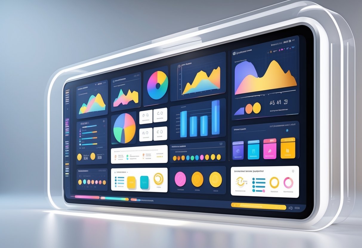
Esports analytics and stats use colour to show performance or progress. For some players, those charts just turn into a mess of shapes and lines.
Causes and Prevalence
Most colour blindness comes from genetics. The genes for colour vision are on the X chromosome, which is why men get hit harder by this than women.
Since men have only one X chromosome, a single faulty gene does the trick. Women have two Xs, so if one gene’s bad, the other usually covers for it.
| Type | Male Prevalence | Female Prevalence |
|---|---|---|
| Red-green | 8% | 0.5% |
| Blue-yellow | 0.01% | 0.01% |
| Complete | 0.003% | 0.003% |
Around 300 million people globally live with colour vision deficiency. In the UK, that’s about 2.4 million men and 150,000 women, according to this source.
Age can make colour vision worse, especially with eye diseases or cataracts. Some medications and injuries can cause it too, but genetics still lead the pack.
The gaming industry has started to notice how many players this affects. These days, more esports titles and platforms are adding colour-blind accessibility features, which is honestly overdue.
What Is Colourblind Mode?
Colourblind mode is basically a software tool that tweaks colours and contrast so people with colour vision deficiency can see things more clearly. It changes up colours, boosts contrast, or swaps out tricky colour combos for something easier to tell apart.
Core Features of Colourblind Modes
Most colourblind modes offer a few main features to help users out. Colour filtering is the big one—the software just shifts problem colours into something you can tell apart.
Contrast enhancement makes important stuff pop from the background. UI elements become way easier to spot.
Saturation adjustments can pump up or tone down colour intensity. Sometimes you want things brighter, sometimes a little muted.
Pattern overlays add textures or symbols to colour-coded stuff. A lot of games now use shapes or patterns with colours for things like health bars, team tags, or ammo.
Gaming expert James Connolly points out that modern colourblind modes often let you customise things. Players can tweak filter strength, pick which colours get replaced, or even stack multiple accessibility options.
Quick tip: Even if you aren’t colour-blind, try out these modes—they can reduce eye strain during marathon gaming sessions.
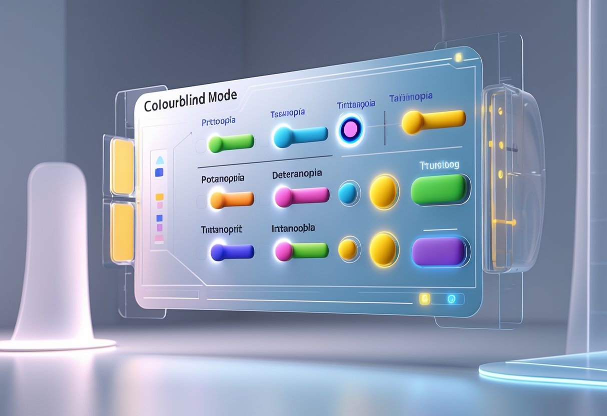
Types of Colourblind Settings
Different types of colour blindness need different filters. Protanopia filters help if you can’t tell red from green by shifting reds into more visible shades.
Deuteranopia modes target the most common type. They adjust greens and boost contrast between red and green.
Tritanopia settings help with blue-yellow confusion. Not many people need them, but for those who do, they’re a lifesaver.
| Filter Type | Addresses | Common In |
|---|---|---|
| Protanopia | Red-green (red weak) | Gaming, Windows |
| Deuteranopia | Red-green (green weak) | Most platforms |
| Tritanopia | Blue-yellow | Newer software |
| Monochrome | All colours | High contrast mode |
Monochrome modes just ditch colour altogether and show everything in grayscale. If you have severe colour vision deficiency, or just want high contrast, this can do the trick.
Some apps let users pick and swap specific colours for something that works better for them.
Device and Software Compatibility
Windows 11 and 10 both have colour filters built in. You’ll find them under Settings > Accessibility > Colour Filters, and they work across everything.
Gaming platforms almost always have colourblind modes now. Steam games usually offer some accessibility options, and PlayStation or Xbox games often include several filter types.
On mobile, iOS and Android both support colour filters in their accessibility settings.
Web browsers can use extensions or built-in features to adjust colours. Chrome, Firefox, and Edge all have something to offer here.
Big games like Fortnite, Apex Legends, and Valorant have their own colourblind settings. Sometimes they even redesign UI elements, not just change colours.
Heads up: If you use a system-wide filter, it’ll change everything—photos, videos, the lot. Game-specific modes usually work better for gaming and won’t mess up your desktop.
More productivity apps now have colourblind-friendly themes too. Microsoft Office, Google Workspace, and design tools offer high-contrast or adjusted colour schemes.
Why Colourblind Mode Is Essential
Colourblind mode opens up gaming for millions of people who’d otherwise get left out. It makes equal participation possible, improves the experience, and lets everyone play without having to ask for help.
Promoting Equal Access
Accessibility isn’t just a nice-to-have in competitive gaming. Since 8% of men and 0.5% of women have some form of colour blindness, a huge chunk of esports fans struggle with standard interfaces.
Without colourblind support, players face serious disadvantages. They might not spot enemies in shooters, miss map info in strategy games, or just not see vital UI elements in the heat of battle.
Quick tip: The best games use symbols, patterns, or high contrast—not just colour—to show differences.
Plenty of players have spent hours lost in matches, unable to tell teammates apart or figure out what’s happening. That’s not really fair, is it?
The top esports titles now launch with multiple colourblind options. It’s a sign that the industry finally gets that real competition needs everyone to see the same info.
Enhancing User Experience
Colourblind modes aren’t just fixes—they actually make games better. Players say they react faster and make smarter decisions when they can see everything clearly.
Red-green colour blindness messes with the most common gaming colours. Enemy markers, health bars, and team indicators all use them.
Here’s what modern solutions include:
- Custom colour palettes
- Shape-based indicators
- High contrast options
- Symbol overlays
These upgrades help everyone, not just colourblind players. Even competitive gamers with normal vision often pick colourblind-friendly settings for that extra clarity.
Heads up: Some colour filters just make games look weird without solving the real problem. The best games rethink their visuals from the ground up.
Players with tritanopia (blue-yellow colour blindness) still get tripped up by minimaps or status icons—some games barely address this.
Supporting Independence
Being independent in gaming means you don’t have to ask, “What colour is that?” at the worst possible moment. Good colourblind support lets players act fast, without needing outside help.
Before colourblind features became common, players came up with workarounds that slowed them down. They memorised positions instead of using colour, or kept asking teammates for info.
These barriers affected:
- Reaction time in matches
- Strategic planning
- Communication with teammates
- Confidence in gameplay
Now, the best tools give colourblind players the same info as everyone else. They can spot enemies, read maps, and track what’s happening without second-guessing.
Pro esports teams now test their games with colourblind consultants. This helps keep tournaments fair, no matter how players see colour.
It’s not about special treatment—it’s about making sure skill, not biology, decides who wins.
Accessibility Guidelines and Legal Requirements

Gaming platforms and esports sites have to follow strict accessibility rules to support colourblind users. These requirements not only keep organisations out of legal trouble but also make sure everyone can enjoy competitive gaming.
Web Content Accessibility Guidelines (WCAG)
WCAG 2.1 Level AA is the global standard for digital accessibility. For colourblind users, the big one is Success Criterion 1.4.1: Use of Colour.
This rule says you can’t use colour alone to show information. So, a gaming website can’t just use red and green to show team scores or player status.
Contrast ratios matter too:
- Normal text: at least 4.5:1
- Large text (18pt+): at least 3:1
- Interactive stuff: at least 3:1
Success Criterion 1.4.3 covers these ratios. A lot of gaming interfaces fail here, especially with dark grey text on slightly lighter backgrounds.
Gaming expert Aaron Connolly says, “Many esports platforms use subtle colour differences that completely disappear for colourblind viewers.”
Other WCAG rules require alternative text for colour-coded graphics and visible focus indicators for keyboard navigation.
Section 508 Compliance
Section 508 applies to US federal agencies and contractors. If a gaming company works with the government, they have to meet these standards.
The law says everyone must get the same info, so colourblind users need alternatives to colour cues.
Pattern overlays, text labels, and shape changes all satisfy Section 508. Gaming interfaces can use stripes or shapes for different teams instead of just colour.
Section 508 also says videos must include audio descriptions for colour-dependent info. Esports broadcasts have to call out team colours and visual cues.
Government agencies can’t buy gaming software that skips proper accessibility features. That’s a big incentive for developers to build inclusive designs.
If companies don’t comply, they risk losing contracts or even facing legal action. That can mean a serious hit to revenue if they mess up on accessibility.
International Standards
EN 301 549 sets the rules for accessibility across the European Union. It basically follows WCAG 2.1 Level AA but throws in extra procurement language for EU countries.
ISO/IEC 40500 lays out the international web accessibility framework. If you run a gaming platform worldwide, you’ll need to juggle a bunch of overlapping requirements.
Country-specific laws add more layers:
- Canada’s AODA makes Ontario gaming companies follow accessibility rules.
- Australia’s DDA bans discrimination in digital services.
- UK’s Equality Act 2010 covers British esports organisations.
As gaming moves to mobile, mobile accessibility standards like ISO/IEC 23026 become even more important. These guidelines cover touch screens and gesture controls.
James Connolly points out, “International gaming tournaments must navigate different accessibility requirements across multiple jurisdictions.”
Costs for compliance can swing a lot depending on the region. Europe tends to hand out bigger penalties than the US, so most global gaming companies just stick to WCAG as their baseline.
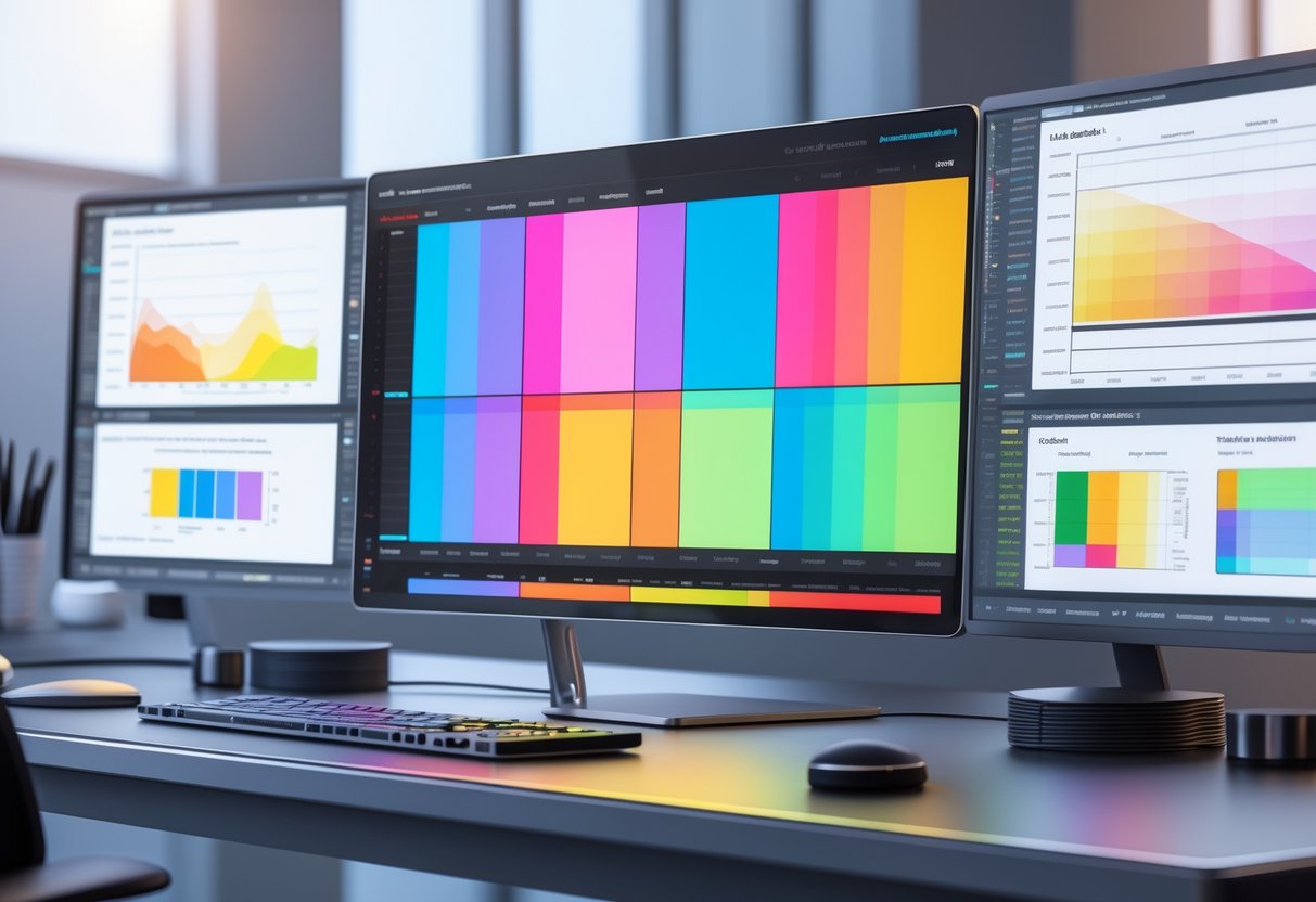
The Role of Colour Contrast
Colour contrast is a must-have for accessible design, especially for colorblind users. It keeps text readable by making sure it stands out against backgrounds at specific ratios.
Good contrast isn’t just about picking the right colours. You need visual indicators that don’t depend on colour alone.
Contrast Ratios Explained
WCAG spells out the minimum ratios for colour contrast. Normal text should hit at least 4.5:1 against its background. Large text can get by with 3:1.
Here’s what those ratios look like:
- Black text on white background: 21:1 ratio
- Dark grey on light grey: maybe just 2:1
- Blue links on white: often 8:1
You can check contrast with tools like WebAIM’s Contrast Checker. Just plug in your hex codes and see if you pass WCAG.
A lot of gaming interfaces use dark themes with bright highlights. These combos usually beat the minimums, so colorblind players find them easier to use.
Text and Background Considerations
Text readability changes a lot depending on the background. Dark text on light backgrounds usually gives you better contrast than the other way around.
Things to keep in mind:
- Font weight matters if your contrast is borderline.
- Bold text can meet accessibility at 3:1.
- Thin fonts need higher contrast.
- Background images can kill your contrast.
HUDs and overlays in games really benefit from high contrast ratios. White text with a dark outline often works best over busy backgrounds.
Test your text at different sizes. Large headings might look fine, but tiny chat text could fail.
Visual Indicators Beyond Colour
If you only use colour, colorblind users are going to miss out. Mix in shapes, patterns, or text labels for a better experience.
Try these alternatives:
- Use icons as well as colour.
- Switch up line styles—solid, dashed, dotted.
- Change up sizes or shapes.
- Add text labels or symbols.
Games already do some of this. Health bars might show red plus a cross. Minimap icons use different shapes, not just colours.
For charts and graphs, patterns like stripes or dots help people tell things apart without relying on colour.
Colour Filters and Assistive Tools
Colour filters change how screens show colours, helping people with colour blindness spot differences they’d otherwise miss. Modern assistive tools and software team up with these filters to build better digital experiences for everyone.
How Colour Filters Work
Colour filters tweak how screens display colours by shifting certain wavelengths. They don’t cure colour blindness, but they make it easier to tell problem colours apart.
Most filters shift reds and greens to make them stand out more. Some darken or brighten certain colours, boosting the difference between shades that look the same to colourblind users.
Common filter types:
- Protanopia filters (for red blindness)
- Deuteranopia filters (for green blindness)
- Tritanopia filters (for blue blindness)
- General contrast boosters
You’ll find these filters built into devices, websites, or special apps. Most operating systems now offer colour filter options under accessibility settings.
Examples of Colour Filter Solutions
Colour filter tech pops up everywhere now. Game engines like Unreal let developers simulate colour blindness to test their games.
Popular solutions:
- Built-in filters on Windows and Mac
- Colour correction settings on mobile devices
- Browser extensions for the web
- Accessibility options on gaming consoles
- Specialised apps like Colour Oracle
Microsoft 365 adds colour filters that adjust the whole screen palette. This makes it easier to tell things apart that differ only by colour.
A lot of websites now offer their own colour adjustment tools. The Recite Me toolbar lets you change text, backgrounds, and link colours however you want.
Helpful testing tools:
- WebAim Contrast Checker
- Toptal Webpage Filter
- Colour Oracle Simulator
The Role of Tools Like andi
Advanced tools like andi use smart tech to find and fix colour issues automatically. They scan sites and apps to spot problems before users run into them.
andi and others can:
- Instantly test colour contrast ratios
- Flag bad colour combos
- Suggest better alternatives
- Check for accessibility compliance
These tools work way faster than manual checks. Developers can catch colour issues early, before launching a product.
Pairing colour filters with smart testing tools gives you a full solution. Users get the filters they need, and developers get better tools to build accessible experiences from the start.
User Interface Design for Colourblind Accessibility
If you want to design good UIs for colourblind gamers, you need smart colour choices, clear visual patterns, and less reliance on colour alone. These three things together make interfaces everyone can use.
Choosing Colour Palettes
Blue is your safest pick for colourblind users. Unlike red and green, blue looks about the same to almost everyone with colour vision deficiency. That makes it great for important buttons, alerts, and key UI elements.
Mixing blue with orange or red gives you strong contrast. These combos are easy for colourblind users to spot. Try to avoid colour combos that usually cause trouble.
Combinations to avoid:
- Red, green, and brown together
- Pink, turquoise, and grey together
- Purple and blue together
- Green with orange, red, or blue if they’re similar in lightness
Safe bets:
- Blue and orange
- Blue and red
- Any two colours with different brightness
About 8% of men and 0.5% of women have red-green colour blindness. So, that’s the main one to design around.
Using Symbols and Patterns
Icons, shapes, and patterns add extra info beyond colour. Use triangles, circles, squares, or stars to show different categories or states.
Textures work great for backgrounds and fills. Dots, stripes, and crosshatches help people tell sections apart without needing to see colour. Gaming UIs really benefit from these visual cues.
Good visual markers:
- Buttons with different shapes (rounded, square)
- Icons next to text
- Borders with various styles (solid, dashed, dotted)
- Patterns in charts and graphs
Mixing patterns and colours takes some care. Sometimes patterns can mess with how bright or dark colours look, so test them out.
Minimising Reliance on Colour Alone
Never rely on colour alone to send a message. Error messages should use red and a warning icon. Success states need both green and a tick or confirmation text.
Label everything:
- Put text labels on all interactive elements
- Use status indicators with colour and text
- Show progress bars with numbers
- Write out error messages, don’t just colour them
Contrast ratios help, but they’re not the whole story. Even perfect contrast can fail if the colours look the same to someone with colour blindness. Always offer more than one way to understand info.
Sound cues also help a ton in games. Audio feedback backs up visual changes that colour alone might not get across.
Impact of Colourblind Modes in Digital Content
Colourblind modes make a huge difference for user experience on web platforms and mobile apps. Millions more people get to access content with fewer barriers.
Web Content and Online Platforms
Web accessibility guidelines say we can’t just use colour to show information. About 8% of men and 0.5% of women have some form of colour vision deficiency.
Streaming platforms like Twitch and YouTube Gaming now have high-contrast modes. These help colourblind viewers spot different chat messages, notifications, and overlays.
Gaming websites really benefit from colourblind-friendly design. Tournament brackets and team stats become readable for everyone when you use proper contrast.
Some key improvements:
- Text labels with colour-coded info
- Pattern-based indicators, not just colour
- At least 4.5:1 contrast for normal text
- Extra cues like icons or shapes
Many esports sites now use descriptive text instead of colour-only buttons. Instead of “click the red button,” you get “click Cancel” or “click Submit.”
Mobile Apps and Operating Systems
iOS has built-in colourblind support in Accessibility settings. Users can turn on filters that change the whole display for different kinds of colour blindness.
Android offers similar support in Vision settings. These system-wide changes affect all apps, keeping things consistent.
Gaming apps really take advantage of these features. Mobile esports games like PUBG Mobile and Call of Duty Mobile have colourblind-friendly UI options in their settings.
OS features include:
- Deuteranopia filters for red-green blindness
- Protanopia adjustments for other red-green types
- Tritanopia support for blue-yellow issues
- Custom controls for colour intensity
More gaming companies now build these features into their apps instead of just relying on the phone’s settings.
Improving Gaming Experiences for Colour-Blind Players
Modern video games keep adding features to help colour-blind players see and enjoy games more easily. These tools range from simple colour filters to deep customisation that lets players tweak how their games look.
Common Features in Video Game Colourblind Modes
Most colourblind modes come with a few standard features. Colour filters are probably the most common—you see them in tons of games. These filters change the whole screen to make colours easier to tell apart.
Games now often have colour customisation settings. Players can swap out specific colours for things like team markers, enemy highlights, or UI buttons. This works better than just a filter because players get to control what they need.
Alternative visual cues help a lot too. Games add symbols, patterns, or shapes along with colours. A health bar might use both red/green and plus/minus symbols.
High contrast options make colours stand out more. These settings boost the differences between shades that colour-blind players have trouble with.
Some games even include colour-blind simulators in their menus. Players can preview how the game looks with different types of colour blindness before making changes.
Popular Games Setting Accessibility Standards
A handful of big games really set the bar for colour-blind accessibility. Overwatch 2 gives players a lot of control here, letting you tweak enemy outlines and UI colours. You can even adjust team colours and ability indicators to suit your preferences.
Fortnite goes a step further, offering detailed colour-blind settings for different vision needs. You can change building colours, enemy markers, and storm indicators.
Apex Legends focuses its colourblind settings on the battle royale experience. Players get to modify enemy highlights, loot rarity colours, and ping markers.
The Call of Duty series lets you customise enemy name tags, tweak minimap colours, and adjust crosshairs. These tweaks make it easier to spot opponents in the heat of battle.
Minecraft supports texture packs with high-contrast options for colour-blind players. The simple graphics actually help—changing colours doesn’t mess with gameplay much.
Customising Colourblind Mode Settings
Nailing the right settings is important, since every type of colour blindness needs its own solution. Tweaking these options can help you see clearly without making your games look weird.
Personalisation for Different Types of Colour Blindness
Most platforms now offer filters for the three main types of colour blindness. Protanopia (red blindness) usually needs red-green filters that push reds toward yellows or blues.
Deuteranopia (green blindness) benefits from similar tweaks, but the focus is on making greens stand out more.
Tritanopia (blue blindness) is a different beast. You’ll want filters that boost blue-yellow contrast and make purples pop.
You can usually adjust how strong the filter is. Try starting around 50% and bump it up until things look right. If you crank it too high, colours might just look off or even confusing.
Some platforms have colour picker tools built in. You can use these to test specific game elements before you commit. Try them on health bars, minimaps, and team markers first.
Monitors and other hardware sometimes include their own colour blind modes. These can work together with software filters for even better results. Check your display settings if the in-game options aren’t cutting it.
Balancing Usability and Aesthetics
Strong filters can make games look pretty washed out or even ugly. The real trick is to find settings that help you play better without wrecking the visuals. Most filters let you preview changes before you commit.
You might want to create different profiles for different games. Shooters usually need stronger filters so you can spot enemies. Story games? You can probably go lighter to keep the atmosphere.
Quick win: Set up toggle shortcuts so you can flip filters on and off fast. That way, you get clarity when you need it and normal visuals when you don’t.
Some games include colour blind options that actually work better than your system’s settings. Try those first—they’re usually tuned for that game’s colours. Overwatch 2 and League of Legends are good examples.
Always test your settings while playing, not just in the menus. What looks good in a lobby might fall apart in the middle of a match. Adjust as you go.
Evaluating and Testing for Colourblind Accessibility
If you want to check your website or app for colour blindness, use both simulation tools and real user feedback. The best approach mixes automated colour blindness simulators with honest input from people who deal with this every day.
Colour Blindness Simulators
Colour blindness simulators let you view your website the way someone with colour vision deficiency does. These tools show what your design looks like with red-green, blue-yellow, or total colour blindness.
Some popular tools:
- Chrome’s built-in DevTools (free)
- Colorblinding.com (web-based)
- Sim Daltonism (Mac app)
- Adobe Color’s accessibility tools
Most simulators offer three main modes: protanopia, deuteranopia, and tritanopia. Some advanced ones even let you simulate partial colour blindness, not just the extremes.
Quick testing tip: Flip your browser to grayscale mode. If something stops making sense in black and white, colour-blind users probably struggle with it too.
Adobe Color Wheel helps check accessibility when you’re creating palettes. But just because colours look different doesn’t mean people will understand what they mean.
Test your designs early—like, at the wireframe stage. It’s way easier and cheaper to fix problems before you’ve built everything.
User Testing With Colour-Blind Participants
You learn a lot more from real colour-blind users than from simulators alone. People who live with colour vision differences spot issues and workarounds that tools just can’t predict.
How to find testers:
- Reach out to local accessibility groups
- Post in colour blindness forums
- Try platforms like UserTesting.com
- Ask friends or coworkers—remember, about 8% of men have some form of colour blindness
During testing, ask participants to do common tasks like filling out forms, clicking buttons, or navigating menus. Watch for uncertainty, mistakes, or signs that colour is tripping them up.
Questions worth asking:
- Which parts are tough to tell apart?
- Do error messages stand out enough?
- Can you spot interactive stuff easily?
- Are charts and graphs readable?
If you can, include people with different types of colour blindness. Red-green issues are most common, but blue-yellow and total colour blindness bring their own headaches.
Document the problem areas and test fixes with the same people if possible. That’s how you actually improve accessibility, not just tick a box.
Frequently Asked Questions
Gamers and developers have plenty of questions about colour-blind modes and how they impact accessibility. These settings aren’t just a nice-to-have—they remove real barriers for millions of players.
Why is incorporating a colour-blind mode in games significant for players?
Colour-blind modes let players with colour vision deficiency actually see what’s going on. Without them, stuff like enemy positions, health bars, or objectives can disappear.
About 8% of men and 0.5% of women deal with some form of colour blindness. For a lot of them, red and green just look the same.
Game colours sometimes make enemies blend into the background. Important items can vanish completely.
Colour-blind modes swap out colour palettes for ones with better contrast. That way, everyone gets a fair shot.
How can colour-blind modes enhance accessibility in video gaming?
These modes swap out hard-to-see colour combos for ones that work for everyone. Fortnite, for example, now offers several colour-blind settings for different vision types.
Accessibility features open up games to bigger audiences. Players who used to skip certain titles can finally join in.
Good design doesn’t just use colour—patterns and symbols help too. That way, you’ve got more than one way to spot what matters.
A lot of games include these features by default now. It’s a sign the industry is moving in the right direction.
What are the benefits of colour-blind modes for individuals with deuteranopia?
Deuteranopia messes with how people see green light. Players with this condition can’t tell red and green apart.
Colour-blind modes for deuteranopia usually shift greens to blues or yellows. That way, elements that used to look the same finally stand out.
Health bars get readable again. Mini-maps show clear lines between friend and foe.
Gameplay stays the same—it just becomes fairer for everyone.
Can you explain the impact of colour-blind friendly designs in the workplace?
Workplace apps benefit from colour-blind accessibility, too. Tools like Trello now offer colour-blind friendly label modes.
These features mix in patterns and text with colours. That way, people can organise tasks without relying on colour alone.
Digital interfaces get more inclusive when they account for colour vision differences. Teams work together more smoothly.
More companies now require accessibility features in their software. It’s a smart move for everyone.
What challenges do people with protanopia face when colour-blind modes aren’t available?
Protanopia affects how people see red light. Reds can look almost black.
Without the right settings, red elements just vanish against dark backgrounds. Warning messages and alerts can go missing.
Games often use red for damage or danger. Protanopia players might not see these crucial cues at all.
If maps use red markers, navigation gets tricky. Players can miss objectives and lose their way in game worlds.
How does the inclusion of colour-blind modes improve user experience across different applications?
Colour-blind modes boost contrast for everyone, not just those with colour vision differences. You’ll probably notice text and visuals stand out more, which just makes things easier to read.
When apps add accessibility features, they come across as more professional. People tend to trust platforms that actually think about different needs—it’s just good design.
These settings also help when you’re using your device outside or in bright light. Stronger contrast means you won’t have to squint at your screen.
Universal design really does make a difference for all users. Even if you don’t need the accessibility features, you might still enjoy the benefits.